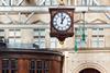
UK: The first national railway clock design since British Rail’s 1974 design manual was unveiled on October 16. The Rail Clock digital design is being rolled out across suitable station information screens, and a 1·8 m diameter physical clock has been installed at London Bridge station.
Rail Clock is the result of the Timepiece for the Railway competition run by Network Rail, the Royal Institute of British Architects and the Design Museum. This attracted more than 100 entries from 14 countries, with the winner being Design Bridge & Partners. Proposals from AREP, Matter and Seymourpowell were also shortlisted, along with a second entry from Design Bridge & Partners.
Mark Wood, Creative Partner at Design Bridge & Partners, said ‘our ambition was to create a new icon of British design that creates lasting impact, and we hope Rail Clock becomes the face of time across the railway for many years to come.’
A physical and digital timepiece
Network Rail opted to use the generic term ‘timepiece’ for the competition to avoid the ’conventions and connotations’ of referring to the instruments as ‘clocks’.
It said the winning design works as a physical and digital timepiece, while reflecting the design and brand history of the railway and ‘most importantly’ makes it easy to know what time it is.
Rail Clock is designed to be easy read on the move, and to provide a place to meet and help navigate busy stations.
The design was unveiled with a large physical clock at London Bridge, and it will also appear in digital form on departure boards across the network, starting at other Network Rail-managed stations including London’s Waterloo, Victoria and Charing Cross.
It can be adapted for use in any digital format, from phones to smart watches, and in partnership with Cognizant will be made available to the public as a watchface via Android app stores in the coming months.
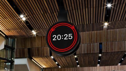
The double arrow of time
The National Rail double arrow logo splits and the pieces travel in opposite directions round the rim of the clock every 60 sec, which Network Rail said gives ‘a calm centrepiece to bustling stations’. The halves converging every 30 sec is a ‘subtle yet powerful visual metaphor’ which ‘speaks to the constant flow and convergence of journeys.’ Every 12 h the completed arrow takes a journey around the face.
The design was created with advice from accessibility experts, using easy-to-read numbers in a slightly amended version of the railway’s Rail Alphabet 2 typeface, based on Rail Alphabet which was originally developed by Margaret Calvert and digitised by Henrik Kubel.
Calvert was a judge on the project. ‘We were looking for something exceptional’, she said. ‘The outcome is an accessible piece of design that’s made for everyone who uses the railway.’
Gerry Barney who created the double arrow logo for British Rail, said ‘in 1965, It was wonderful to win the competition to design the symbol of our railway: the double arrow. Now in 2025, I’m thrilled to see the winning entry that continues to celebrate it in a new timepiece for future generations of rail passengers to enjoy — what Design Bridge & Partners have created is really magic.’
Rail Minister Lord Peter Hendy said the clock ‘represents a bridge between the historic past and a new future for our railways’. He added ‘this government will create an integrated railway network that’s more reliable, consistent, efficient and accountable, thus delivering growth, jobs and homes. Good design, like this brilliant, clever timepiece, is a fundamental part of achieving this.’