


USA: The New York Metropolitan Transportation Authority introduced a redesigned network map on April 2. The first such full redesign since 1979 sees a more diagrammatic style introduced, with lines shown either on a rectilinear grid or at 45°, instead of the previous flowing curves and irregular geometry.
The map’s more ordered graphical style is designed to help simplify wayfinding. Each service is depicted as a separate line, though in the same group colours as previously. This allows skipped stations and peak-hour limited-stop extra services to be represented more clearly. Station accessibility is also indicated, along with out-of-station transfers.
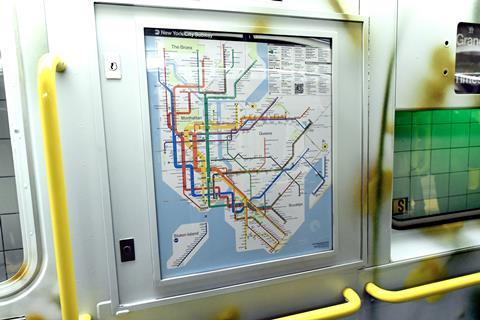
The new map echoes the 1972 Unimark version, which embraced the schematic concept, increasing geographic distortion in order to improve the clarity of cluttered sections. Applying these principles, the new map distorts the width of Manhattan to enable the five distinct north-south service groups to be shown in full. All of 17 distinct north-south services are depicted crossing the east-west Canarsie Line L, but the resulting horizontal stretching means that Central Park is depicted as a square rather than as a vertical rectangle.
The map also shows airport access options and main line commuter rail routes.